|
THE KIRKWOOD
JOURNAL | BLOG |
|
USING ELECTRONIC FILE MANIPULATION, OUR UNCOATED PRESS SHEET MATCHES COATED PROOFING & PRINTING12/18/2020
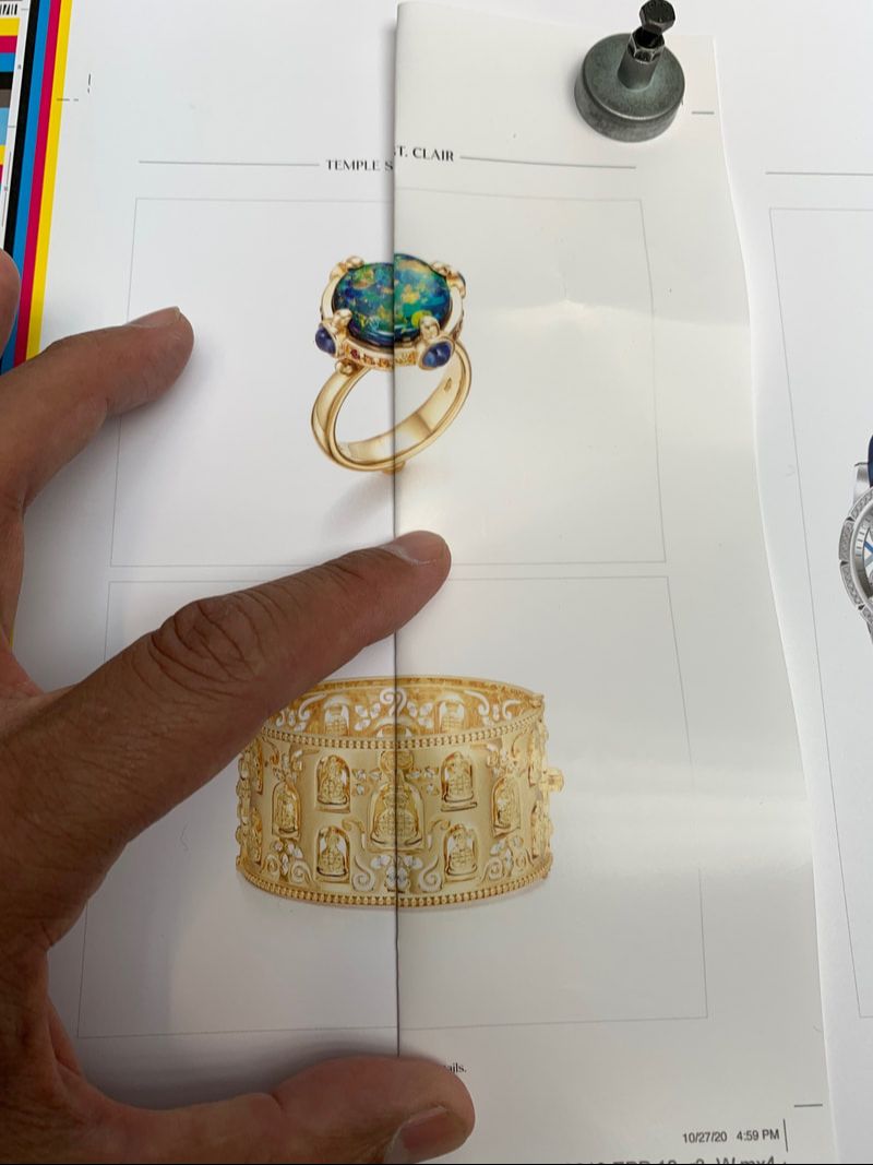 When printing on an uncoated paper the ink is absorbed into the paper and this characteristic does not have to mean that images printed on uncoated stock are less crisp and defined.The sheet on the right is our EPSON proof The left is our uncoated press sheet Take a closer look at the paper shade of the Epson proof verses the white shade of the uncoated paper - there is a big difference. Using an UNCOATED paper doesn't mean you sacrifice any quality and Kirkwood can PROVE & PROOF it!* A BIT OF INFORMATION ABOUT PAPERS:
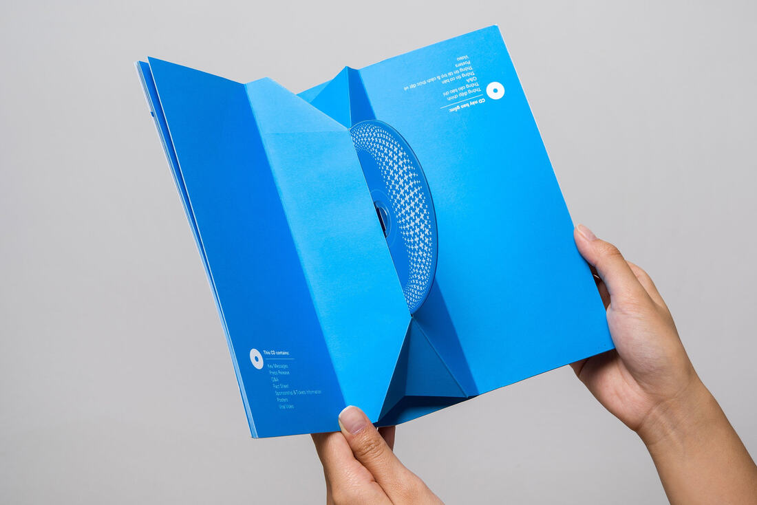
SELECTING COATED OR UNCOATED PAPER FOR YOUR PROJECTWhen choosing coated or uncoated papers, talk to us at Kirkwood about the effect you hope to achieve with your print work in terms of crispness vs. warmth, smoothness or a high tactile feel and economy vs. style. We can guide you in selecting just the right combination of inks, paper textures, finish and coatings and print techniques that make your projects outcome is exactly what you want. Whether you choose a gloss, silk or matte finish it really comes down to your personal preference. Some people think that gloss is classy while others consider it to be a bit tacky. Uncoated paper can be used for full color projects and can be vibrant or produce a natural, refined look. If your document is designed to be written on, your best option is to select an uncoated stock. You'll find letterheads, stationary, invitations, etc. are almost always printed using an uncoated paper. (PRO TIP - always test the stock you are going to use on your laser printer - heavy weights and textures can be problematic.) * Reach out - Kirkwood will prove this to you.
THE POSTAL REGULATORY COMMISSION APPROVES USPS’ TEMPORARY PRICE INCREASE FOR COMMERCIAL PARCELS9/14/2020
The Postal Regulatory Commission (PRC) has approved the temporary price increases for commercial domestic parcel products that USPS proposed last month. Commercial Plus rates are only offered to high volume shippers and retail prices for parcel products are unaffected.
The planned commercial price increases for Priority Mail Express, Priority Mail, First-Class Package Service (FCPS) and Commercial Parcel Select will take effect Oct. 18, 2020 at 12 a.m. Central time and continue until Dec. 27, 2020 at 12 a.m. Central time. After that, prices will revert to 2020 prices. Here are the current prices and temporary price increases: • Parcel Select Destination Entry DDU: starts at $3.19 (current), 24 cents (temporary increase) • Parcel Return Service: starts at $3.05 (current), 24 cents (temporary increase) • Parcel Select Lightweight: starts at $1.81 (current), 24 cents (temporary increase) • FCPS Commercial: starts at $2.74 (current), 25 cents (temporary increase) • Priority Mail Commercial: starts at $7.02 (current), 40 cents (temporary increase) • Parcel Select Ground: starts at $6.92 (current), 40 cents (temporary increase) • Parcel Select DSCF: starts at $4.37 (current), 40 cents (temporary increase) • Parcel Select DNDC: starts at $5.98 (current), 40 cents (temporary increase) • Priority Mail Express Commercial: starts at $22.75 (current), $1.50 (temporary increase) The temporary price adjustments are in response to heightened package volume due to the Coronavirus pandemic, as well as expected increases in online shopping during the holidays. Details at: https://www.prc.gov/docs/114/114473/Order5673.pdf  (This post is part of a series about the color blue, which has become a symbol of our evolution over the last fifteen years.)
In a time when blue appears on everything from automobiles to sports drinks, it might be hard to believe there was an era when blue was one of the rarest colors in the world. 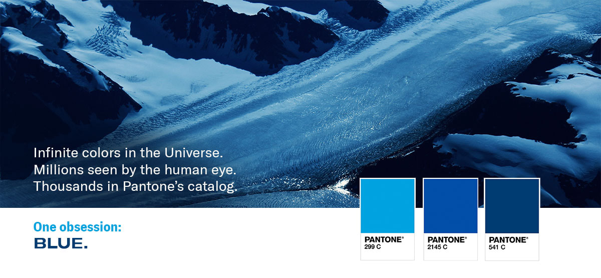 When it comes to printing, color management is an art of precision and mathematical science.But the numbers are a little more fluid when it comes to measuring color elsewhere. A brief jog around StackExchange and Google indicates there could be anywhere from 18x10³³ to an infinite number of colors in the Universe. The human eye is estimated to see a pretty wide range of hues – between one and ten million. A computer monitor? It could be 65,000 or 16.8 million colors. Pantone? 1,867 – last we checked, but there’s always a new swatch being unveiled. For all the ranges, estimations and guesses about color, you’d think choosing a favorite would be like picking a show on Netflix: an endless odyssey of surfing what may be just too many options. (If a video disappears from our watchlist unnoticed, was it ever really there?) But it turns out humans are actually pretty good at picking their preferred shade, and it’s overwhelmingly consistent worldwide: Blue. 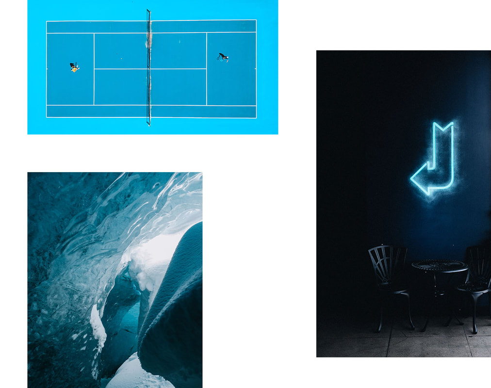 Blue has the record for the most popular Crayola crayon in the U.S., and the most used color on the Internet. And though a study by Hull 2017 UK City of Culture and GF Smith can’t determine if the world’s favorite color is green-blue or blue-green (maybe: teal), it may indicate that – like us Americans – we all have an affinity for the colors of the outdoors – namely bodies of water and forested hills.
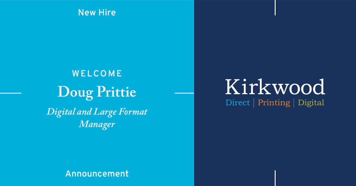
We’re no exception here at Kirkwood. When we kicked off our brand refresh, there was one rule: our color had to stay blue. “Blue has been a part of Kirkwood’s brand for nearly 15 years. In that same time, we’ve grown our business revenues by over 780% when digital printing and digital media were altering the world as we knew it – and when people said print was dead,” says Bob Coppinger, CEO. To us, blue was always more than the C in CMYK and the B in RGB for our digital and spot color print runs. It stood for being strong and bold, steadfast and inspired. It represents a connection to our past and a vision for our future. And while we may change with the times, the times aren’t changing our appreciation of color and our love of blue. Tell us about what color means to you. Kirkwood proudly announces the hiring of Doug Prittie as |
|
904 Main Street, Wilmington, MA 01887
545 8th Avenue, New York, NY 10018 (978)-658-4200 Copyright ® 2024 Kirkwood Printing, LLC |