Creating Creative Excellence
THE GALACTIC VIEW
0 Comments
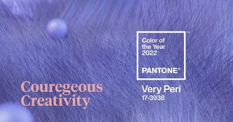
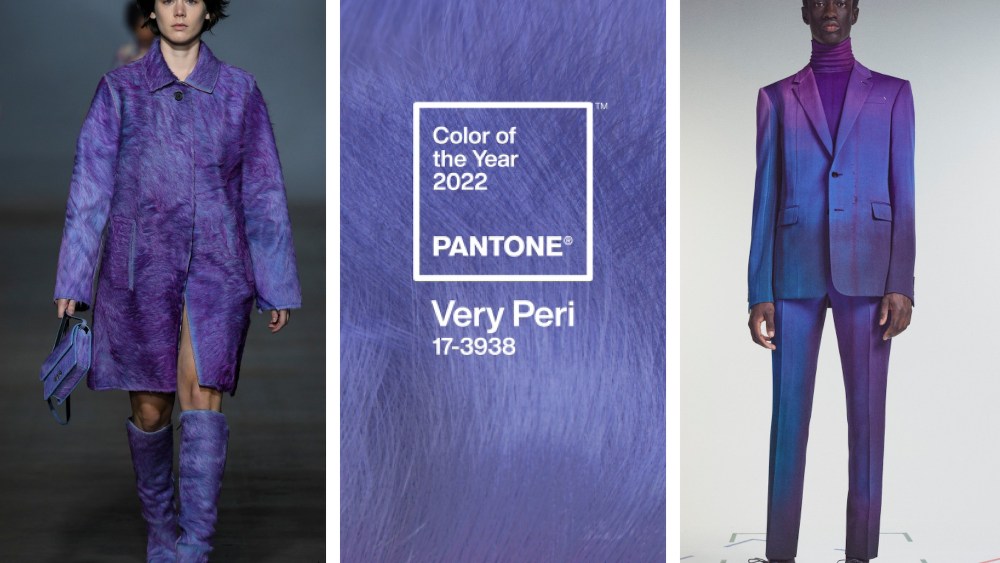
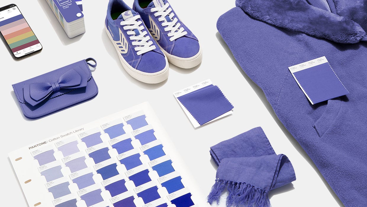
Pantone introduces VERY PERI, a hue of Kirkwood's favorite color! PANTONE has introduced Very Peri as the color of the year 2022. The dynamic periwinkle blue hue with a vivifying violet red undertone blends constancy with energy resulting in a happy and warm hue. This year’s color is a periwinkle blue with violet-red undertones — designed, the company says, with the glowing screens of our digital world in mind. PANTONE 17-3938 Very Peri, a warm and friendly blue hue with a carefree confidence and joyful attitude, emboldens uninhibited expression and experimentation. This enthusiastic blue hue displays a dynamic presence and a whimsicality that lends itself to unpredictable color harmonies and spontaneous color statements. Futuristic in feeling, PANTONE 17-3938 Very Peri takes on distinct appearances through application to different materials, finishes, and textures, from shimmery metallics, lustrous sheens, and high-tech materials, to hand-crafted looks and natural fibers. "As we move into a world of unprecedented change, the selection of pantone 17-3938 very peri brings a novel perspective and vision of the trusted and beloved blue color family,’ says Leatrice Eiseman, Executive Director, Pantone Color Institute. Encompassing the qualities of the blues, yet at the same time possessing a violet-red undertone, Pantone 17-3938 Very Peri displays a spritely, joyous attitude and dynamic presence that encourages courageous creativity and imaginative expression." This year's choice is a "dynamic periwinkle blue hue with a vivifying violet-red undertone that blends the faithfulness and constancy of blue with the energy and excitement of red." - Courtesy of Pantone
|
|
904 Main Street, Wilmington, MA 01887
545 8th Avenue, New York, NY 10018 (978)-658-4200 Copyright ® 2024 Kirkwood Printing, LLC |

