KIRKWOOD PRINTING - Offset | Digital | Wide Format | Direct Mail | Branded Merchandise
  • ABOUT
    • Company TImeline
    • WORKING WITH KIRKWOOD
    • SUSTAINABILITY
    • Global & Ethical Citizenship
    • Compliance
    • Diversity & Inclusion
    • QUALITY ASSURANCE
  • WORKING AT KIRKWOOD
    • OPEN POSITIONS
  • PROMOTIONAL PRODUCTS
  • OUR PRODUCTS
    • Offset >
      • Projects
    • Digital >
      • Indigo
      • Wide Format
      • Digital Finishing
      • ANIMATED COMMUNICATIONS
    • Kirkwood Direct
  • UPLOADS/DOWNLOADS
    • CLIENT UPLOAD FILES
    • PDF RESOURCES
    • ARE YOUR FILES PRINT READY ?
  • CUSTOMER PRODUCTS
  • CONTACT US
    • THE KIRKWOOD EXECUTIVE TEAM
    • MEET THE SALES TEAM

THE KIRKWOOD BLOG

WGBH – Wins Silver IHAF Award

12/17/2021


Creating Creative Excellence

Picture
Calendar pages with die-cut stand
Picture
WGBH – Wins Silver IHAF Award
 
Creating Creative Excellence
 
The Creative team at GBH has won an IHAF (In-House Agency Forum) SILVER Award for the 2021 Space Phenomena Calendar.
​

​The award-winning project - printed on our HP Indigo 7900 digital press - included 13 calendar cards and a custom-designed, die-cut stand.  

Featuring photographs and imagery of diverse space phenomenon, the calendar provided monthly inspiration and science information for their educator audience.  
The month of April features the waxing and waning phase of the moon.  The waxing phase is the time until it has not become a full moon and the time when it has passed the new moon. The waning is the phase of the moon once it has finished being a full moon but has not become a new moon. The size of the moon during this phase is growing. This calendar is an extraordinary teaching tool and fits perfectly on any desk. ​

THE GALACTIC VIEW

Picture

The Galactic View
 
GBH Project Manager, Heidi Lewis, reports “the Kirkwood Team was a big part of creating this now award-winning project. Thank you so much for all the careful attention and for your beautiful production of this project (not to mention the careful assembly and fulfillment of each package).
​Watch the video on the competition here.   

​At Kirkwood, we strive to challenge ourselves, pushing the creative and technical limits of our technology in order to explore new frontiers for our customers. Where others might see obstacles, we see a new way of thinking and doing. No job is too small, no client request too demanding. The word “no” does not exist in the Kirkwood dictionary. We aren’t printers, we are partners—and our ultimate goal is to help our clients achieve their dreams. An idea in print is merely our platform. ​We do not rest until a job is perfect, and our entire team is committed to the end goal. Every step of the way, our clients can rest assured that we’ve got their back, we’re a second set of eyes, and we’re invested in their hard work and the integrity of their design. Looking for a printer, we would love to connect marketing@kirkwoodus.com
​

Pantone Announces the Color for 2022

12/9/2021


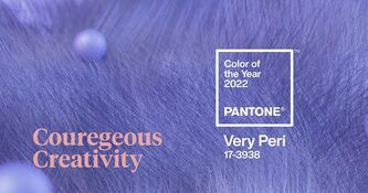
Pantone introduces VERY PERI, a hue of Kirkwood's favorite color!

Picture
Picture
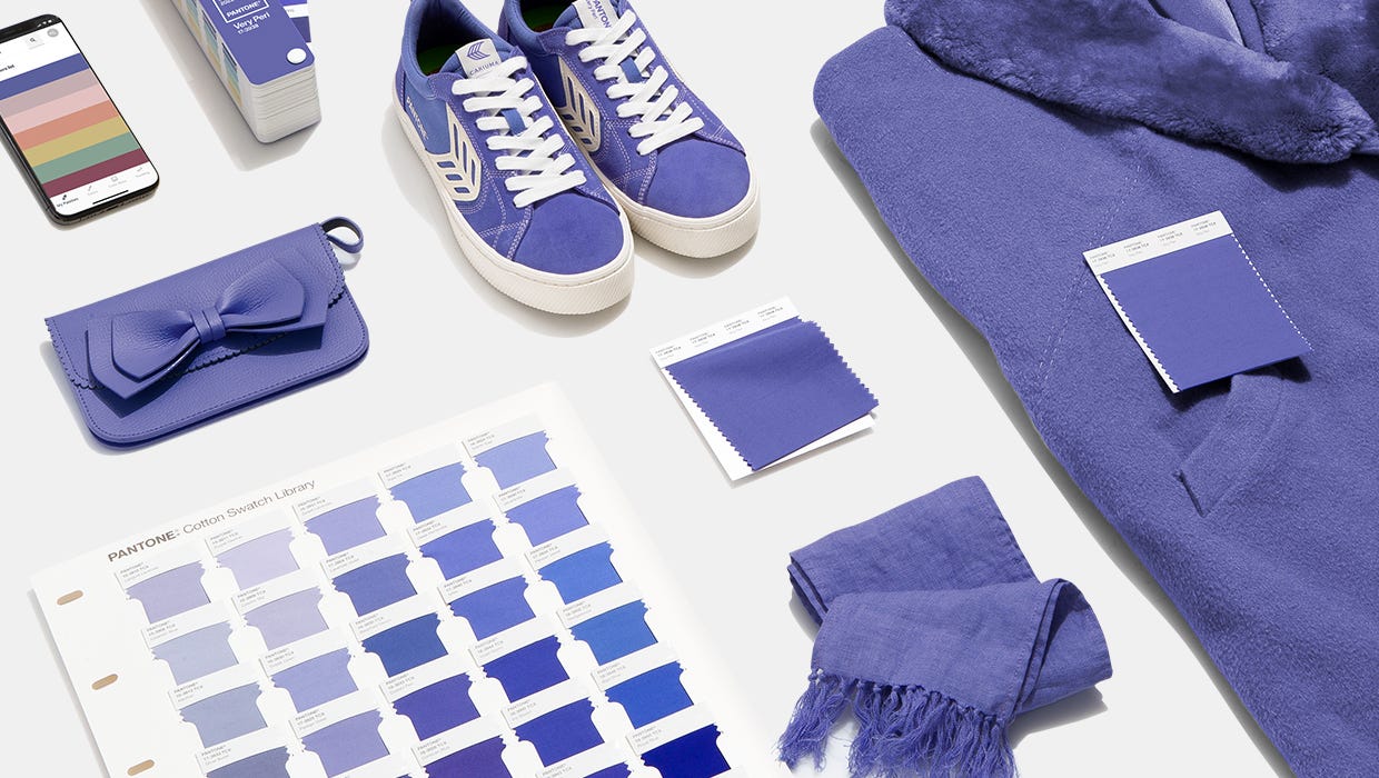
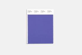
PANTONE has introduced Very Peri as the color of the year 2022. The dynamic periwinkle blue hue with a vivifying violet red undertone blends constancy with energy resulting in a happy and warm hue. This year’s color is a periwinkle blue with violet-red undertones — designed, the company says, with the glowing screens of our digital world in mind. 
​
PANTONE 17-3938 Very Peri, a warm and friendly blue hue with a carefree confidence and joyful attitude, emboldens uninhibited expression and experimentation. This enthusiastic blue hue displays a dynamic presence and a whimsicality that lends itself to unpredictable color harmonies and spontaneous color statements. Futuristic in feeling, PANTONE 17-3938 Very Peri takes on distinct appearances through application to different materials, finishes, and textures, from shimmery metallics, lustrous sheens, and high-tech materials, to hand-crafted looks and natural fibers.
Picture
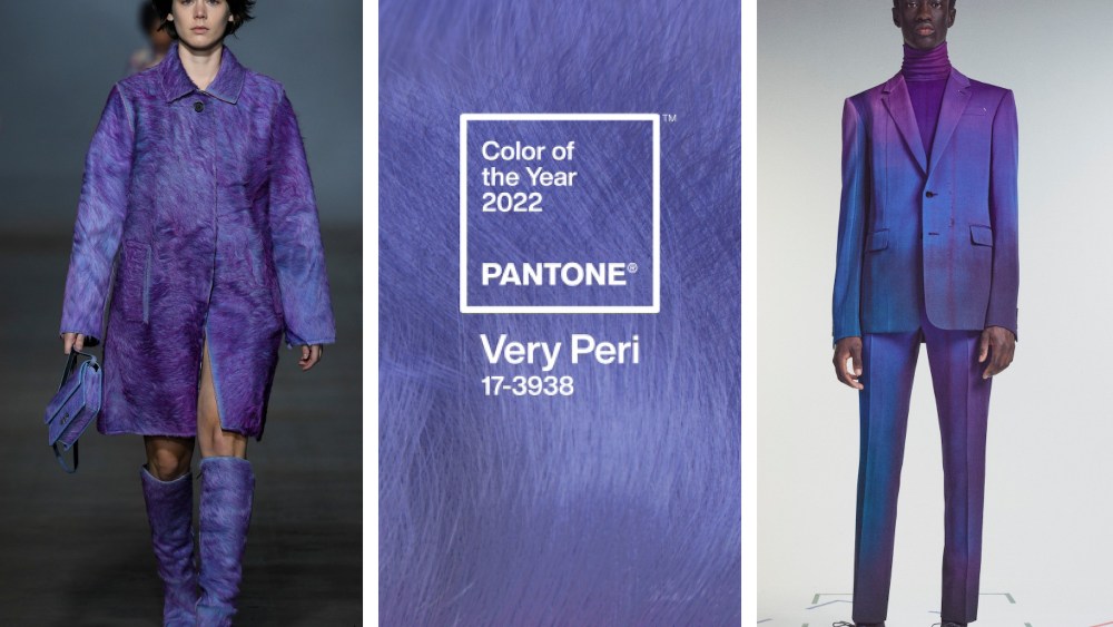
"As we move into a world of unprecedented change, the selection of pantone 17-3938 very peri brings a novel perspective and vision of the trusted and beloved blue color family,’ says Leatrice Eiseman, Executive Director, Pantone Color Institute. Encompassing the qualities of the blues, yet at the same time possessing a violet-red undertone, Pantone 17-3938 Very Peri displays a spritely, joyous attitude and dynamic presence that encourages courageous creativity and imaginative expression."
Picture
Picture
This year's choice is a "dynamic periwinkle blue hue with a vivifying violet-red undertone that blends the faithfulness and constancy of blue with the energy and excitement of red."  -  Courtesy of Pantone

    Archives

    October 2022
    July 2022
    June 2022
    April 2022
    March 2022
    February 2022
    December 2021
    December 2020
    September 2020
    March 2019
    November 2018
    October 2018
    January 2017
    March 2016
    January 2016
    December 2015

ABOUT
FIND YOUR SALES REPRESENTATIVE
CAREERS
​CLIENT UPLOADS
​​CONTACT US
PROMOTIONAL PRODUCTS
PRIVACY POLICY
Picture
904 Main Street, Wilmington, MA  01887
​545 8th Avenue, New York, NY  10018
​(978)-658-4200                                                   
​Copyright® 2023 Kirkwood
  • ABOUT
    • Company TImeline
    • WORKING WITH KIRKWOOD
    • SUSTAINABILITY
    • Global & Ethical Citizenship
    • Compliance
    • Diversity & Inclusion
    • QUALITY ASSURANCE
  • WORKING AT KIRKWOOD
    • OPEN POSITIONS
  • PROMOTIONAL PRODUCTS
  • OUR PRODUCTS
    • Offset >
      • Projects
    • Digital >
      • Indigo
      • Wide Format
      • Digital Finishing
      • ANIMATED COMMUNICATIONS
    • Kirkwood Direct
  • UPLOADS/DOWNLOADS
    • CLIENT UPLOAD FILES
    • PDF RESOURCES
    • ARE YOUR FILES PRINT READY ?
  • CUSTOMER PRODUCTS
  • CONTACT US
    • THE KIRKWOOD EXECUTIVE TEAM
    • MEET THE SALES TEAM