|
THE KIRKWOOD
JOURNAL | BLOG |
|
Unveiling the Superiority of HP Indigo 7900 and 12000: A Game-Changer in Printing Technology2/21/2024  In the realm of printing technology, the HP Indigo series stands as a paragon of innovation and efficiency. Among its illustrious lineup, the HP Indigo 7900 and 12000 reign supreme, offering a plethora of benefits that revolutionize the printing industry. In this blog, we delve into the myriad advantages of these cutting-edge machines and elucidate why they are indispensable assets for businesses seeking exceptional print quality and unmatched versatility. Unrivaled Print Quality: One of the most compelling reasons to opt for Kirkwood's digital print option is the HP Indigo 7900 and 12000 is their unparalleled print quality. THE Indigo ElectroInk technology and advanced color management capabilities, these printers deliver astonishingly crisp, vibrant, and consistent results. Whether it's intricate designs, vivid images, or precise text, every printout reflects the epitome of perfection, capturing the attention of viewers and elevating the visual appeal of printed materials to unprecedented heights, (let one of our team show you the expanded color gamut). 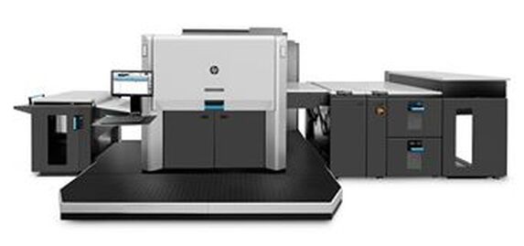  Versatility Redefined: In today's dynamic market landscape, versatility is paramount, and Kirkwood's team of Indigo's excel in this aspect. From short runs to large-scale production, these printers offer unmatched flexibility, accommodating diverse substrates, including paper, synthetics, and specialty media. Whether you're printing marketing collateral, packaging materials, or personalized documents, the ability to seamlessly switch between jobs with minimal setup time empowers businesses to meet varied customer demands efficiently and cost-effectively. Eco-Friendly Printing: In an era increasingly focused on sustainability, the HP Indigo 7900 and 12000 shine as eco-conscious printing solutions. By leveraging HP Indigo's liquid ElectroInk technology, these printers reduce waste, energy consumption, and environmental impact compared to traditional offset printing methods. Additionally, their compatibility with a wide range of certified substrates and eco-friendly inks further underscores their commitment to sustainable printing practices, allowing businesses to uphold their environmental stewardship while delivering exceptional results.  In conclusion, our robust team of Indigo presses represent the pinnacle of printing technology, offering a compelling blend of superior print quality, versatility, productivity, eco-friendliness, and reliability. Embrace the future of printing with our Indigo's and elevate your business to new heights of success. 
0 Comments
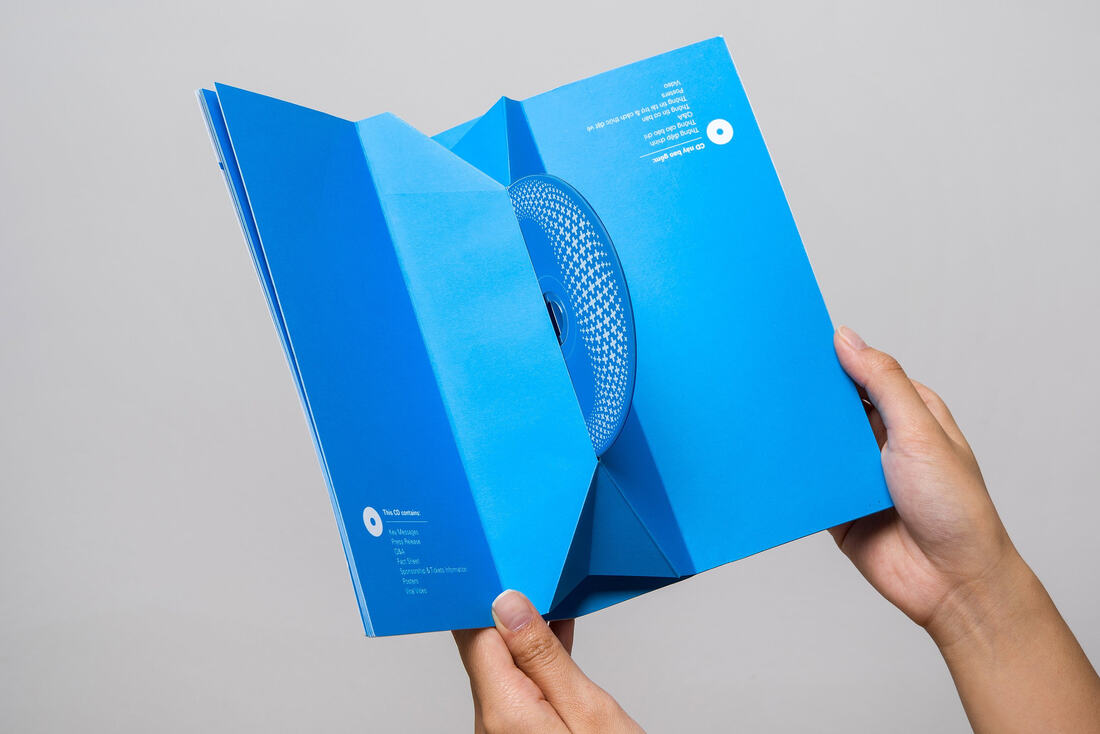
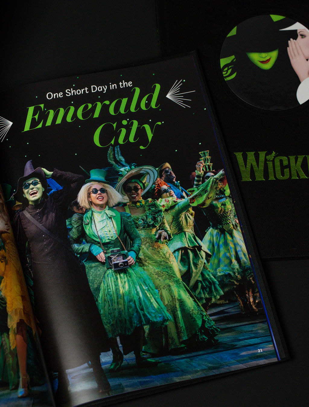
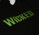
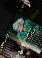
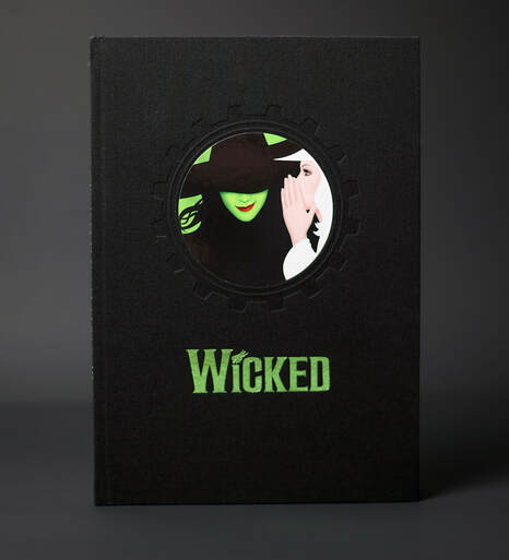  A Journey Through the Land of Oz In a celebration of two decades of magical moments and extraordinary storytelling, Kirkwood, a renowned, world-class printer, has unveiled the much-anticipated 20th-anniversary commemorative book for the iconic musical, Wicked. This timeless production, with music and lyrics by Stephen Schwartz and a captivating book by Winnie Holzman, has left an indelible mark on the world of musical theater. Wicked, inspired by Gregory Maguire's novel "Wicked: The Life and Times of the Wicked Witch of the West," intricately weaves the narrative before and after Dorothy's arrival in the Land of Oz. At its heart, the story revolves around the unlikely friendship between Elphaba Thropp (later known as the Wicked Witch of the West) and Galinda Upland (later known as Glinda the Good). The musical explores their enduring bond, navigating through opposing personalities, conflicting viewpoints, shared love interests, and their reactions to the corruption within the Wonderful Wizard's government.
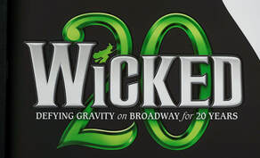
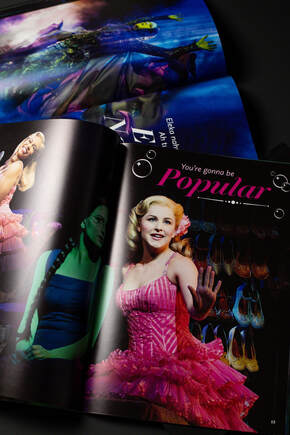
The musical's triumph on Broadway paved the way for a multitude of international productions, including a thriving West End run. Wicked's financial success soared to new heights, joining the exclusive club of Broadway shows with over $1 billion in total revenue, alongside The Phantom of the Opera and The Lion King. In 2017, Wicked surpassed The Phantom of the Opera as Broadway's second-highest grossing musical, trailing only The Lion King. A Tale of Friendship, Struggle, and Defying Gravity Crafted with a deep appreciation for the narrative's essence, the casebound anniversary issue of the book encapsulates a tale of friendship, struggle, and the defiance of gravity. Craig Wenrich, SVP Sales at Kirkwood, expressing his passion for the project, emphasized the joy of involvement from conceptualization to selecting the perfect fabrics and print techniques for the Wicked book. Leveraging his expertise and relationships, Wenrich curated the papers and bindery techniques to enhance the book's quality. The use of Verona black cloth, coupled with sophisticated print techniques such as debossing, foil stamping, and Smyth sewing, resulted in an extraordinary collaboration that truly embodies the magic of Wicked. 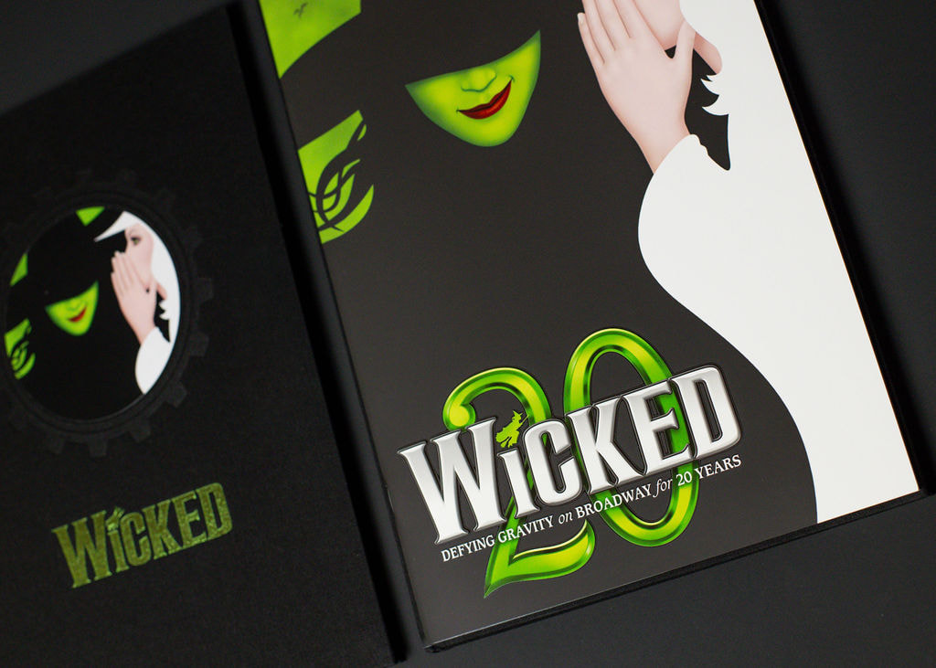 Wicked's 20th-anniversary commemorative book is a testament to the musical's enduring magic. As fans revisit the journey of Elphaba and Glinda, they are invited to relive the spellbinding moments that have made Wicked an integral part of the theatrical landscape for the past two decades. Whether it's the soaring melodies, the intricate choreography, or the timeless themes of friendship and acceptance, Wicked continues to captivate audiences around the world, leaving an indelible mark on the history of musical theater.
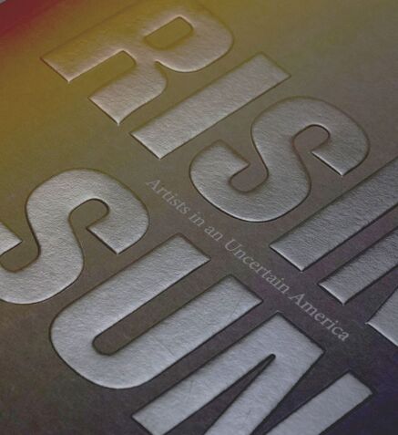
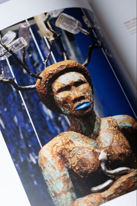
 A Transformative ExhibitionIn this remarkable venture, two historic institutions, the African American Museum in Philadelphia and PAFA, come together to present "Rising Sun: Artists in an Uncertain America." This multi-venue exhibition showcases new works by 20 celebrated artists, each responding to a critical question: "Is the sun rising or setting on the experiment of American democracy?"
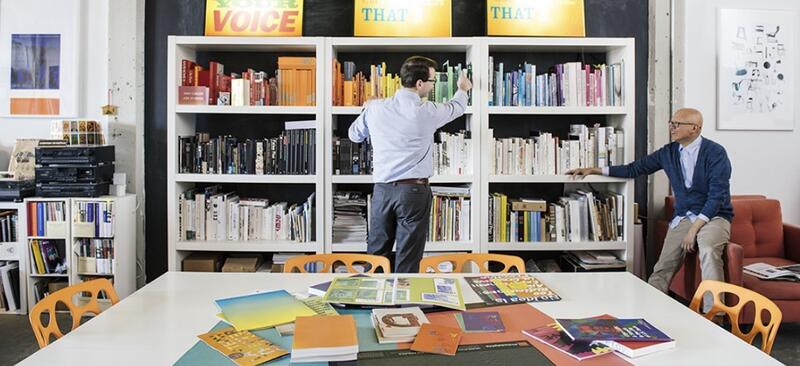
We recently had the pleasure of sitting down with Allan Espiritu, Founder & Creative Director and Kevin Kernan, the Principal at GDLOFT. Kevin is a true multi-talent who wears many hats in the world of design. His partner, Allan affectionately refers to Kevin as the "business guy" of the dynamic duo. With a degree from Rutgers University, Kevin brings not only creative vision but also a strong foundation in the business side of design to the GDLOFT team. Allan also wears the hats of a tenured graphic design professor and department head in the Fine Arts department at Rutgers, Camden, where he once had Kevin as his student back in 2002. Their story is a testament to recognizing talent, as Allan speaks fondly about how he knew Kevin possessed exceptional business acumen right from the start. This intuition led to their incredible partnership that has thrived over the last two decades. During our conversation, curiosity led us to inquire about the intriguing name "GDLOFT" and its origins.
Allan chuckled warmly and shared a bit of the backstory, which indeed has a touch of humor. He confessed that "GDLOFT" was the password for the Yale University server at the School of Arts during his time as a graduate student. His choice of this unique moniker was with a twinkle in his eye, as he always believed it might bring a smile to the faces of his professors at Yale University.
While the name may have been rooted in a touch of playfulness, GDLOFT has since become synonymous with creative excellence and thoughtful design. It's a reminder that sometimes, even in the most unexpected places, inspiration and innovation can emerge. Allan's choice of the name is a testament to his creative spirit and his penchant for finding unique perspectives in the world of design. Behind every great design agency, there's often an interesting story. GDLOFT's journey from a Yale University server password to an esteemed design firm reflects the power of imagination and how a dash of humor can leave a lasting impression. GDLOFT specializes in branding, strategy and design, and has a notable presence in non-profit and higher education design. They have a remarkable track record of producing outstanding books, and the "Rising Sun Book" only adds to their impressive portfolio. 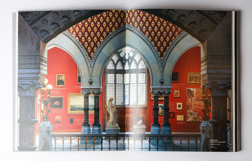
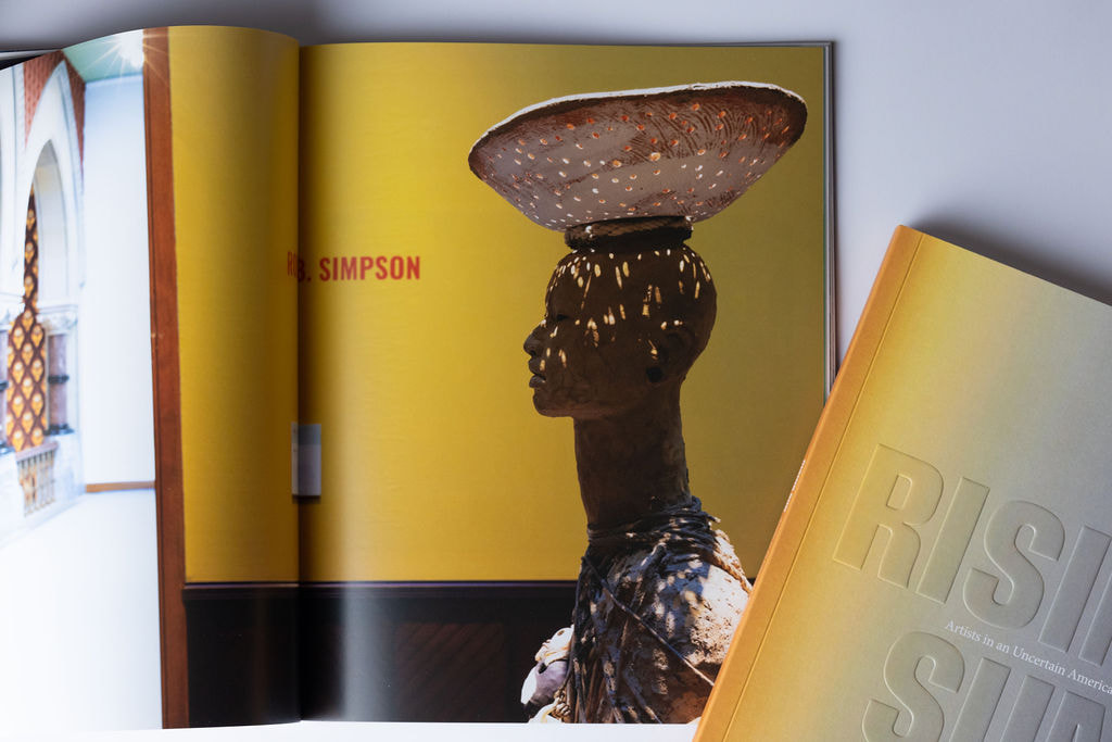
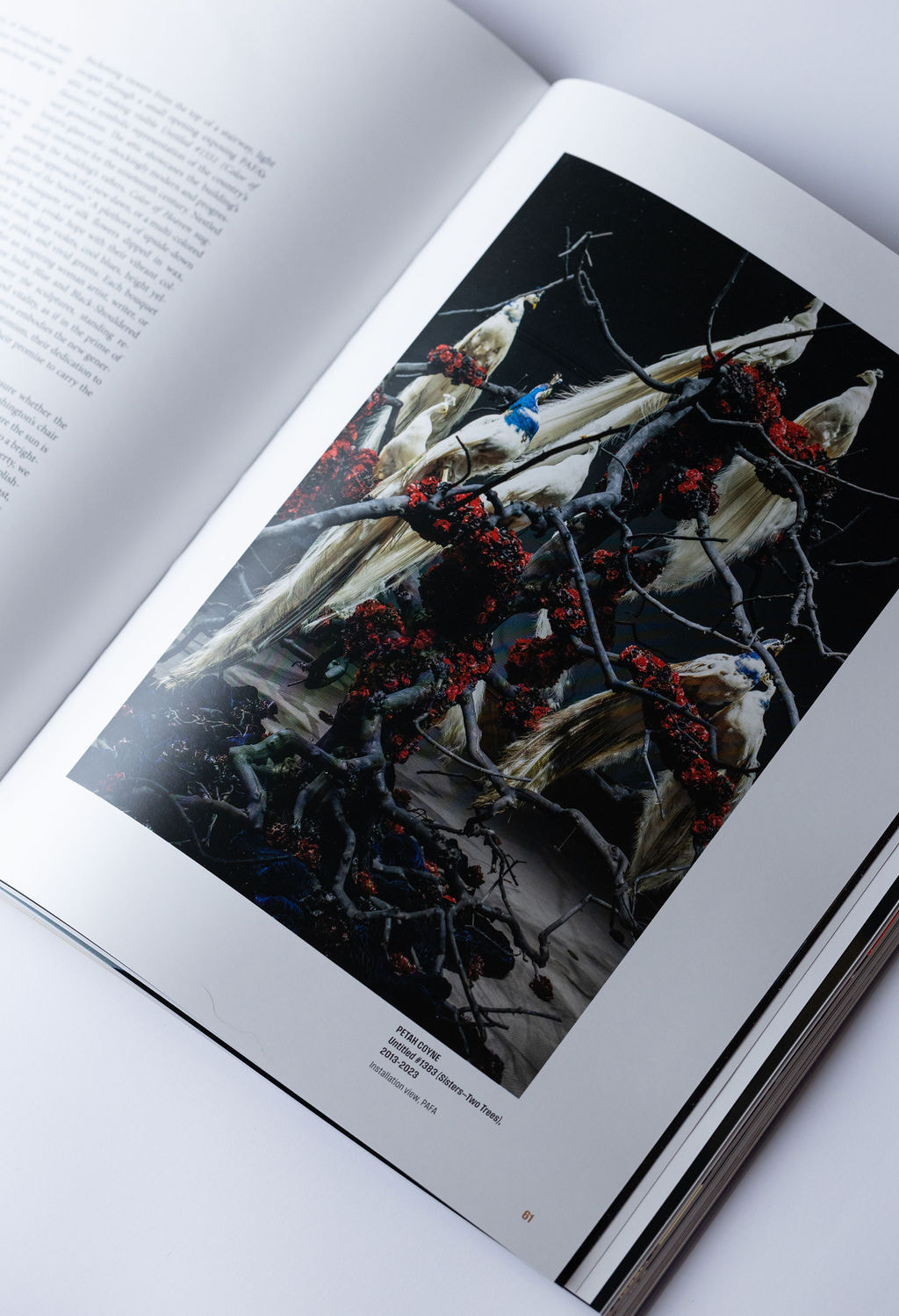
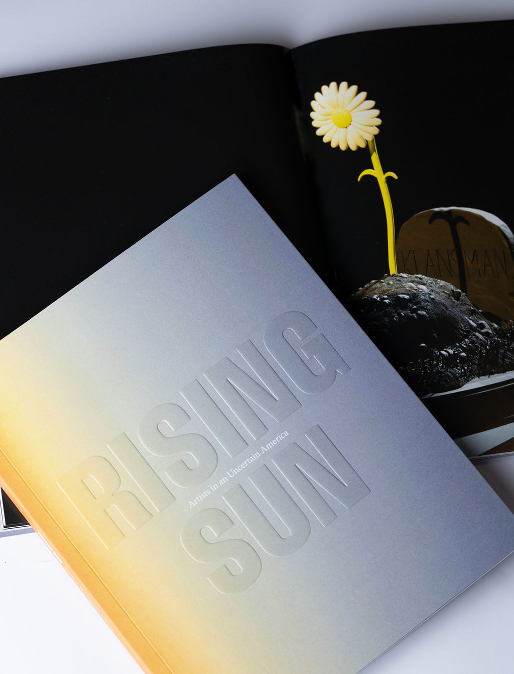
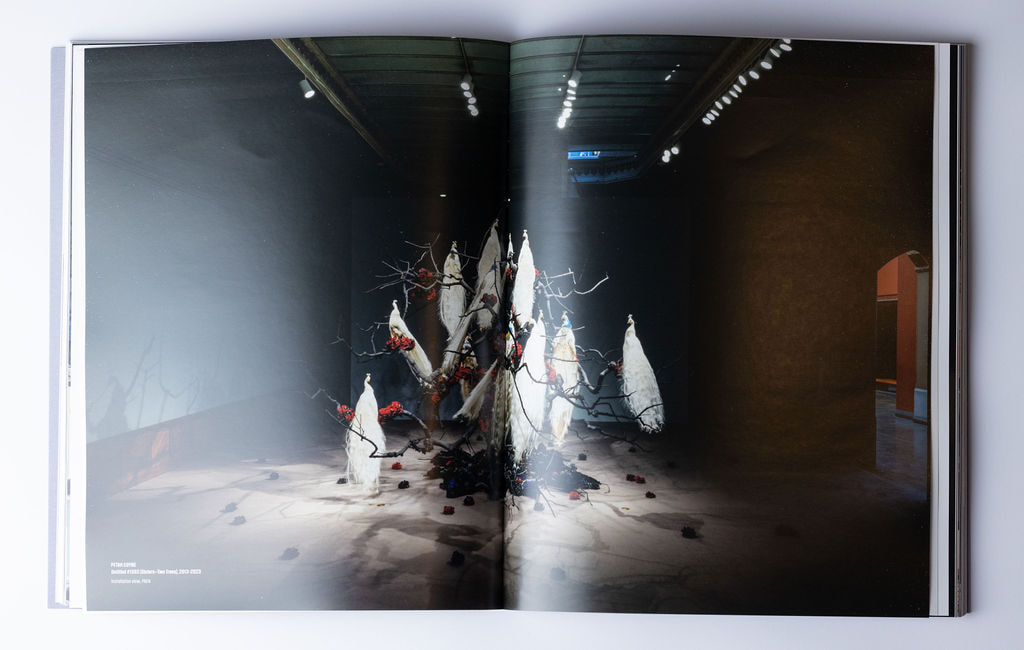 A Profound CollaborationThe "Rising Sun Book" is not just a book; it's a work of art, representing the power of collaboration between two esteemed institutions, talented artists, and visionary designers at GDLOFT. The result is a thought-provoking piece that reflects the complexities and nuances of the American democratic experiment. The list of artists contributing to this endeavor is impressive and adds to the richness of the project. It includes Shiva Ahmadi, John Akomfrah CBE, La Vaughn Belle, Tiffany Chung, Lenka Clayton, Petah Coyne, Martha Jackson Jarvis, Demetrius Oliver, Eamon Ore-Giron, Alison Saar, Dread Scott, Rose B. Simpson, Sheida Soleimani, Renée Stout, Mark Thomas Gibson, Dyani White Hawk, Hank Willis Thomas, Deborah Willis, Wilmer Wilson IV, and Saya Woolfalk. 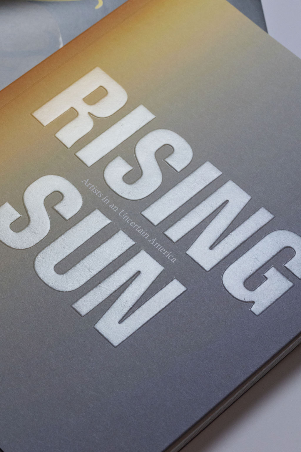 We applaud GDLOFT for their exceptional work in bringing the "Rising Sun Book" to life and for their commitment to creating art that challenges and inspires. This project is not just a book; it's a profound reflection of our times and a reminder of the transformative power of collaboration and creative vision. If you find yourself in the Philadelphia area, be sure to explore the "Rising Sun: Artists in an Uncertain America" exhibition—it's an opportunity to immerse yourself in art that stimulates reflection and encourages dialogue.
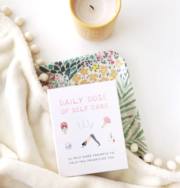
The Rising Sun Book, designed by GDLOFT, is a testament to the creative collaboration between institutions, artists, editors, and designers. It serves as a visual and intellectual gateway into this thought-provoking exploration of American democracy. We commend GDLOFT for their role in bringing this project to life, and we eagerly anticipate the impact Rising Sun will have on all who engage with it. If you're in the Philadelphia area, make sure to visit this extraordinary exhibition https://risingsunphilly.org, it is open through December 31, 2023. It's a unique opportunity to immerse yourself in art that challenges and inspires, as well as to reflect on the profound question: Is the sun rising or setting on the experiment of American democracy? HEY THERE!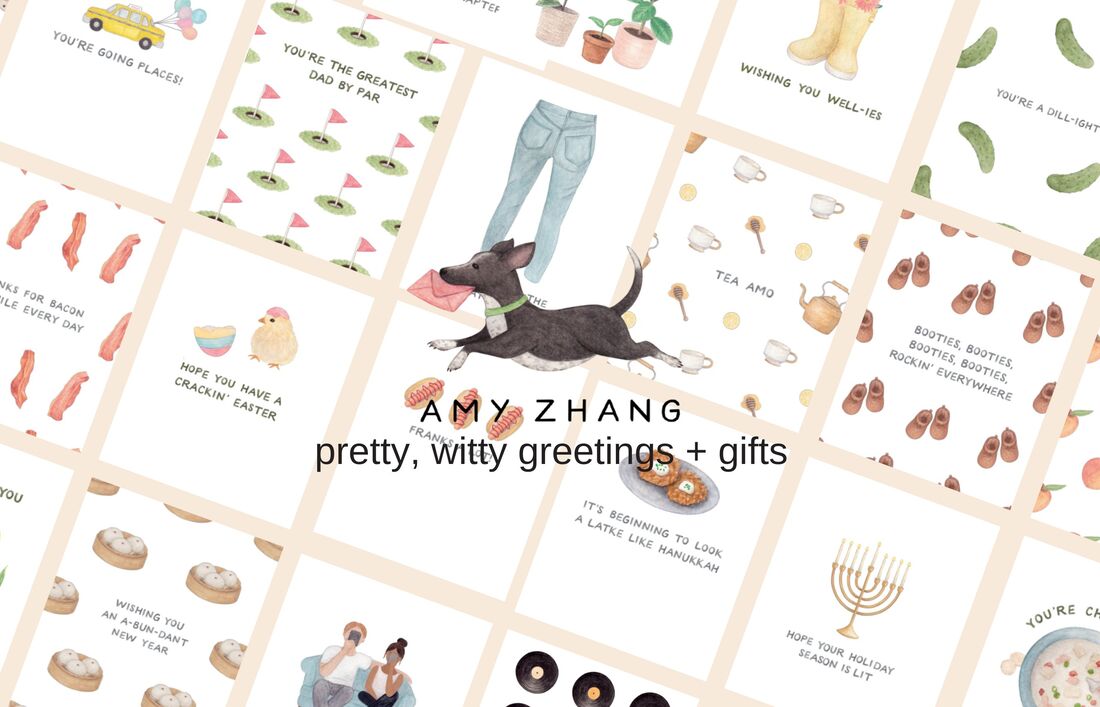 In a world filled with digital communication and fleeting text messages, there's something undeniably special about receiving a handwritten note or a beautifully crafted greeting card. Enter Amy Zhang Creative, LLC, a charming haven for all things pretty and witty in the world of greetings and gifts. After a delightful interview with Amy Zhang, the creative genius behind this thriving business, it's clear that her passion for design, her knack for clever puns, and her dedication to quality have propelled her brand to national recognition. A Journey Rooted in Literature and Design Amy Zhang's journey into the world of creative design began with a unique blend of academic prowess and a lifelong love for cards. Armed with an undergraduate degree in English Literature and a master's degree in graphic design, Amy possesses the perfect combination of language and visuals. As a child, she found herself captivated by the greeting card section of grocery stores and gift shops, a fascination that would eventually shape her career. Amy's professional journey kicked off in the wedding invitation design industry, where she immersed herself in the intricate world of stationery. From understanding the differences between A-2 and A-6 envelopes to mastering the art of crafting elegant and visually appealing invitations, Amy honed her skills and developed a deep understanding of the industry.
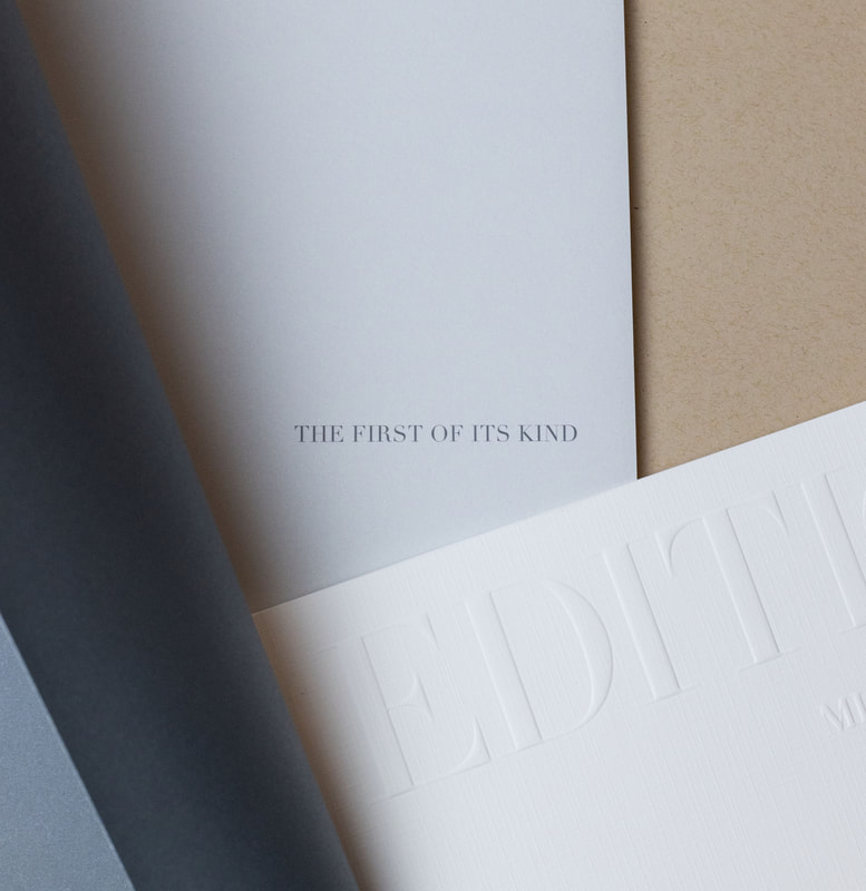
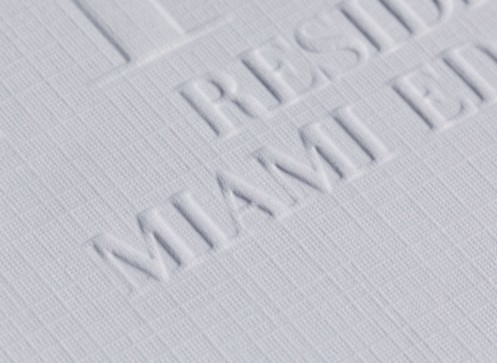
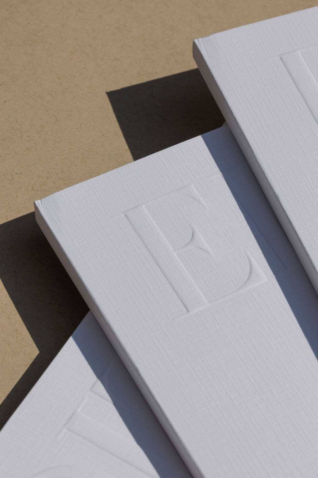
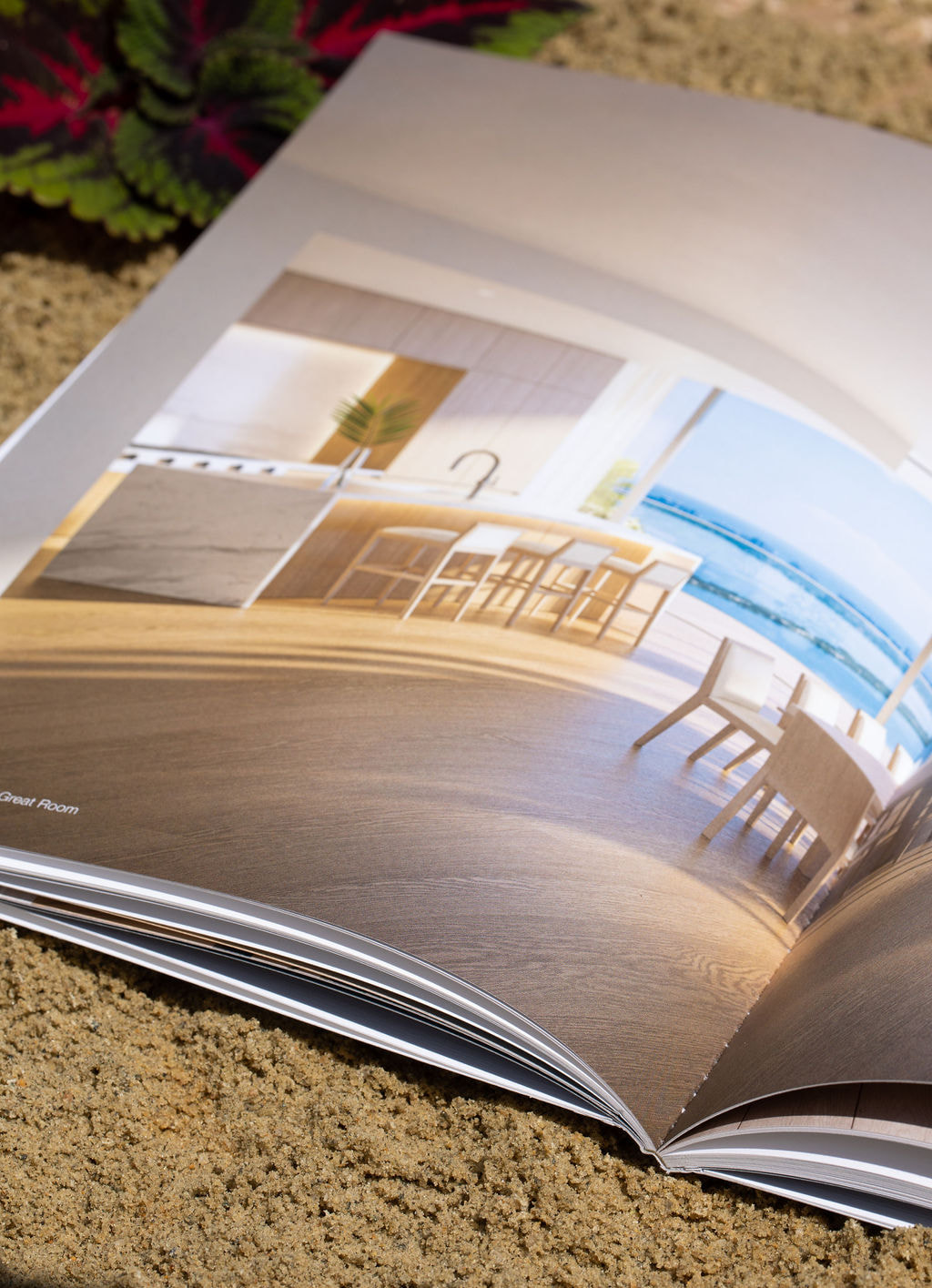
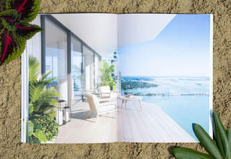
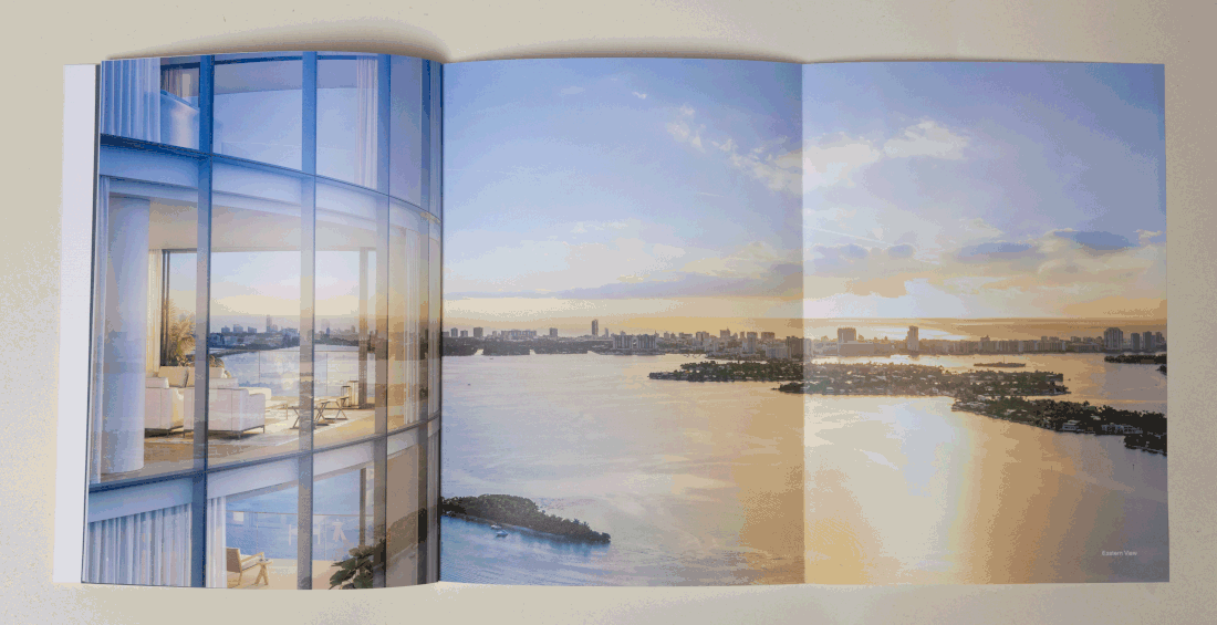
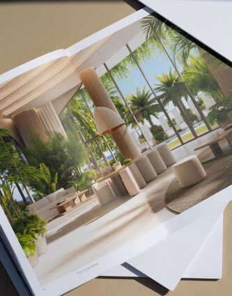
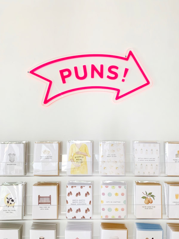 The Future of Amy Zhang Creative, LLC If you are a lover of all things stationary, give Amy Zhang and the team a follow @shopamyzhang or stop in their new retail store and say hello, located at 71 NH-101A, Unit 14, Amherst, NH 03031. In a world that often rushes past the simple joys of handwritten notes and beautifully crafted cards, Amy Zhang Creative, LLC, stands as a testament to the enduring charm of thoughtful and artistic expression. Amy's blend of creativity, quality, and a commitment to American-made products sets her brand apart, ensuring that her customers receive not just a card but a genuine piece of art that reflects the heart and soul of the sender. Explore the world of Amy Zhang at www.shopamyzhang.com and experience the magic of pretty, witty greetings and gifts. Elevating Print Design: The Story Behind the EDITION Residences Brochure & Slipcase In the realm of design innovation, one name shines brightly: Kerissa Voldeck, the Founder and creative force behind Kēvo Studio. With an extraordinary vision and an unyielding passion for aesthetics, the masterfully crafted EDITION Residences Brochure & Slipcase is a work of art that thoughtfully balances creativity and intentionality. 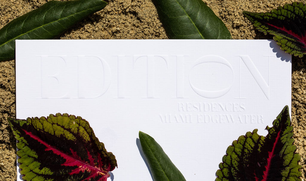 Printed on the exquisite Mohawk Carnival Linen and Mohawk Superfine papers, this creation showcases Kerissa's meticulous attention to detail. Complimented by the subtle elegance of PMS 425 gray, the piece is brought to life through vibrant 4-color process imagery seamlessly integrating CGI and photography. The book’s color journey is a harmonious blend of visual impact and calm contemplation.
Kerissa's prowess is evident in her ability to transform a mere brochure into an artful representation of creativity, design, and intentionality. The EDITION Residences Brochure & Slipcase serves not only as a showcase of skilled design, but also as an embodiment of her studio’s philosophy.
In a world filled with fleeting digital experiences, Kēvo Studio’s work invites us to appreciate the importance of tangible design and its ability to create moments of delight. The EDITION Residences Brochure & Slipcase is a masterpiece that beckons you to engage, to touch, and to be captivated by its artistry. It's an ode to the power of physical design to evoke emotion, spark anticipation, and offer a tactile connection that goes beyond the visual. Kerissa Voldeck's legacy as a designer and visionary is etched into every detail of this creation. The EDITION Residences Brochure & Slipcase transcends its role as a promotional piece and emerges as a reminder of the enduring impact of physical design. kevostudio.com |


|
904 Main Street, Wilmington, MA 01887
545 8th Avenue, New York, NY 10018 (978)-658-4200 Copyright ® 2024 Kirkwood Printing, LLC |